2018, Dec 07
Analysing Bitcoin Data
1. Introduction
On this blogpost we will try to predict the price of bitcoins in USD using regression and data analysis techniques
2. Dependencies
For this task we will use the following libraries:
- Numpy: For matrix and vector operations
- Pandas: To load and process our data
- Seaborn and Matplotlib: To visualize data
- Sklearn: To train, create and validate our models with different hyper-parameters
import pandas as pd
import numpy as np
import seaborn as sns
import matplotlib.pyplot as plt
from sklearn.linear_model import LinearRegression
from sklearn.model_selection import train_test_split
from sklearn.metrics import mean_squared_error, r2_score
# Load data
df = pd.read_csv("bitcoin_dataset.csv")
3. Data Analysis
3.1 Here is a list of the features present in our data:
btc_market_price : Average USD market price across major bitcoin exchanges. (target variable)
btc_total_bitcoins : The total number of bitcoins that have already been mined.
btc_market_cap : The total USD value of bitcoin supply in circulation.
btc_trade_volume : The total USD value of trading volume on major bitcoin exchanges.
btc_blocks_size : The total size of all block headers and transactions.
btc_avg_block_size : The average block size in MB.
btc_n_orphaned_blocks : The total number of blocks mined but ultimately not attached to the main Bitcoin blockchain.
btc_n_transactions_per_block : The average number of transactions per block.
btc_median_confirmation_time : The median time for a transaction to be accepted into a mined block.
btc_hash_rate : The estimated number of tera hashes per second the Bitcoin network is performing.
btc_difficulty : A relative measure of how difficult it is to find a new block.
btc_miners_revenue : Total value of coinbase block rewards and transaction fees paid to miners.
btc_transaction_fees : The total value of all transaction fees paid to miners.
btc_cost_per_transaction_percent : miners revenue as percentage of the transaction volume.
btc_cost_per_transaction : miners revenue divided by the number of transactions.
btc_n_unique_addresses : The total number of unique addresses used on the Bitcoin blockchain.
btc_n_transactions : The number of daily confirmed Bitcoin transactions.
btc_n_transactions_total : Total number of transactions.
btc_n_transactions_excluding_popular : The total number of Bitcoin transactions, excluding the 100 most popular addresses.
btc_n_transactions_excluding_chains_longer_than_100 : The total number of Bitcoin transactions per day excluding long transaction chains.
btc_output_volume : The total value of all transaction outputs per day.
btc_estimated_transaction_volume : The total estimated value of transactions on the Bitcoin blockchain
3.2 NAN values
The first thing i like to do when preprocessing my data is to check for NAN values.
# Check for NANs values
nans = df.isna().sum()
nans[nans > 0]
# Number of data points
len(df)
3.3 Get Rid of NANs
There are multiple ways of dealing with NAN values. If you only a couple of samples which some attribute is a NAN, you might just be better off with dropping those samples entirely. In our case, as there are only 21 NANs values out of 2920 we can safely adopt this strategy.
# Drop NANs
df.dropna(axis=0, inplace=True)
3.4 Feature Correlation
A good way to take a general look at your data is to visualize the correlations between your features. We can do this using a heatmap of the correlation matrix of our data. We will calculate our data correlation matrix using the Pearson Correlation Cofficient defined as:
$$\rho_{X,Y} = \frac{cov(X,Y)}{\sigma_X \sigma_Y}$$
Where $cov(X, Y)$ is the covariance between feature $X$ and $Y$ and $\sigma_X$ is is the standard deviation of feature $X$.
This Value ranges between +1 and -1.
With +1 being total direct correlation, -1 represeting total inverse correlation and 0 meaning no correlation at all.
sns.heatmap(df.corr(method='pearson'), annot=True, cmap='RdYlGn', linewidths=0.2, yticklabels=True, fmt='.2f')
fig=plt.gcf()
fig.set_size_inches(15,10)
plt.show()
If we look at the correlation between our target variable (btc_market_price) with the rest of the features we can get rid of features that don't influence our target variable, which are the ones whose correlation coefficient is close to 0.
We can also remove redundant features. These are the ones whose correlation coefficient with all other variables is very similar. Take a look at the columns btc_difficulty and btc_hash_rate. Notice how the correlation coefficient of these 2 features with all others, is almost identical. This means we can remove one of these features and reduce the redundancy in our data.
# Drop useless features
df.drop(['btc_cost_per_transaction_percent', 'btc_n_orphaned_blocks', 'btc_estimated_transaction_volume'], axis=1,
       inplace=True)

# Drop redundant features
df.drop(['btc_hash_rate', 'btc_n_transactions_excluding_chains_longer_than_100'], axis=1, inplace=True)
3.5 Data evolution over time
Since our data is a time-series let's take a look at how some of the features change over time.
# Extract the years present in our data and the index where the year changes
labels = list(df['Date'])
last_seen = ['2010']
index = [0]
for i in range(len(labels)):
    labels[i] = labels[i].split('-')[0]
    if labels[i] != last_seen[-1]:
        last_seen.append(labels[i])
        index.append(i)

# Plot data evolution over the years
plt.plot(df['btc_market_price'], label='Average Market Price (USD)')
plt.plot(df['btc_difficulty'], label='Mining Difficulty')
plt.plot(df['btc_n_transactions'], label='Daily Confirmed Transactions')
plt.plot(df['btc_market_cap'], label='Market Cap')
plt.gca().set_yscale("log")
plt.yticks([])
plt.xticks(index, last_seen)
plt.xlabel('Year', labelpad=20)
plt.gcf().set_size_inches(15, 10)
plt.legend()
plt.show()
The Bitcoin Network came online around 2009.
As we can see the more valuable Bitcoin becomes, the harder it is to mine it and the more daily transactions are performed.
Notice the early spike in Daily Confirmed Transactions, halfway into 2010, when the Mining Difficulty was low because their Market Price and Market Cap were basically non-existent. The people who bought Bitcoins in these early transactions and sold them around the spike present halway through 2011 and on 2014 were the ones that probably got rich with Bitcoins.
4. Estimation
We will now proceed to evaluate different regression models on our data, and find out which one best estimates the Bitcoin Market Price.
# Drop features that make the problem too easy
df.drop(['Date', 'btc_output_volume', 'btc_market_cap', 'btc_miners_revenue',
         'btc_estimated_transaction_volume_usd'], axis=1, inplace=True) # Also drop Date which is a string
seed=42 # random seed for reproductibility

# split data into train and validation
x = df.iloc[:,1:].values
y = df.iloc[:, 0].values
x_train, x_val, y_train, y_val = train_test_split(x, y, test_size=0.3, random_state=seed)
# Train a simple Linear Regressor with our data
model = LinearRegression(n_jobs=-1)
model.fit(x_train, y_train)
y_pred = model.predict(x_val)
5. Metrics
There are several metrics one can take into account to evaluate the performance of a Regressor. We will use RMSE (Root Mean Squared Error) and coefficient of determination (R^2 Score)
5.1 RMSE
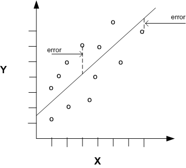
The RMSE is a measure of the quality of an estimator and represents the distance from the actual values to the predicted ones. It is given by the formula:
$$RMSE=\sqrt{\frac{1}{n}\sum_{i=1}^{n}(Y_i - \hat{Y})^2}$$Where $n$ is the number of samples, $Y_i$ is the actual value and $\hat{Y}$ is the predicted value.
This gives us an idea of how close to each other the predicted and actual values are, so the smaller the RMSE, the better.

5.2 R^2 Score
R^2 score gives us an insight on how close our model gets to a perfect prediction and consequently, how far it gets from the worst possible model. It is give by the formula:
$$R2 = 1 - \frac{\textbf{Y} - \hat{\textbf{Y}}}{\textbf{Y} - \bar{\textbf{Y}}}$$
Where $\textbf{Y}$ is the vector with the actual values, $\hat{\textbf{Y}}$ the vector with the predictions and $\bar{\textbf{Y}}$ a vector filled with the mean value of $\textbf{Y}$ which represents the worst model possible.
The values of this metric range from -1 to +1, with +1 representing the best possible model and -1 representing a model that's even worse than just taking the mean of our target vector ($\textbf{Y}$).

6. Visualizing Results
6.1 Prediction Plot
We will plot our predictions alongside the actual value in order to visualize the performance of our regressor. For visualization purposes we will use the entire dataset to make our prediction.
plt.plot(df['btc_market_price'], label='Average Market Price (USD)')
plt.plot(model.predict(x), label='Prediction')
plt.gca().set_yscale("log")
plt.xticks(index, last_seen)
plt.xlabel('Year', labelpad=20)
plt.gcf().set_size_inches(15, 10)
plt.legend()
plt.show()
We can see that our regressor performs considerable well. Specially after on the predictions made after the year 2014
6.2 Residual Plot
A very useful well to visualize the robustness of a regressor is by using a residual plot. Which will give us an insight unto how biased our model can be.
#plot residual plot
xmin = min(int(np.min(model.predict(x_val))), int(np.min(model.predict(x_train))))
xmax = max(int(np.max(model.predict(x_val))), int(np.max(model.predict(x_train))))

# Visualize the results with a residual plot
plt.scatter(model.predict(x_train), model.predict(x_train) - y_train, label='Training')
plt.scatter(model.predict(x_val), model.predict(x_val) - y_val, label='Validation')
plt.hlines(y=0, xmin=xmin, xmax=xmax)
plt.title("Residual plot using training and validation data")
plt.gcf().set_size_inches(15, 10)
plt.legend()
plt.show()
The way to analyse a residual plot is to look for a pattern in the projected data points. If they are not distributed in a consistently random way, it means that our model can surely be improved. As you can see on the left side of the plot the points are not distributed randomly, this means that our regressor cna be improved. You can find a lot more about residual plots here.
print(np.sqrt(mean_squared_error(y_val, y_pred)))
print(r2_score(y_val, y_pred))
6. Conclusion
In this post we learned how to pre-process our data. We learned some useful visualization techniques to find and remove useless and redundant features. We also learned how to build a simple regressor and how to evaluate it's performance with 2 different metrics.
