2019, May 07
Predicting Flight Delays
Introduction:
This blog will provide an example of how to properly solve a problem where we need to train a classifier over some data distribution.
In this case I will be using this dataset from kaggle. This dataset contains data about different flights that happened in 2015, including data about its delay and if it was cancelled.
So, the purpose for this dataset is to determine the flights that were or were not heavily delayed (30min limit).
For this project, I've decided I will use a logistic regressor, whose training code I will be explaining now.
Dependences
- pandas: vector and matrix operations
- numpy: extra functionality for pandas
- sklearn: to preprocess and split our data and train ML models
- matplotlib: using pyplot for pretty-plotting our results
- seaborn: also fancy plotting
import pandas as pd
import matplotlib.pyplot as plt
import numpy as np
import sklearn
import seaborn as sns
Missing Values
Now we will check the missing values of the dataset to detect unusable features and when and how are the rest of the missing values meaningful.
import pandas as pd
import matplotlib.pyplot as plt

# read and get nans by columns
dataset = pd.read_csv(os.path.join(os.getcwd(), r'data\flights.csv'))
sums = dataset.isna().sum(axis=0)

nan_count_limit = 0

# crate tuples (nan_sum, column_name), filter it and sort it
non_zero_pairs = sorted([pair for pair in zip(sums, dataset.columns) if pair[0] > nan_count_limit])
non_zero_pairs.append((len(dataset), 'TOTAL'))

# split tuples into separate lists
non_zero_sums, non_zero_labels = zip(*non_zero_pairs)
nans_range = np.asarray(range(len(non_zero_sums)))

# print info
for i, (non_zero_sum, non_zero_label) in enumerate(non_zero_pairs):
    print('{}, {}: {}'.format(i, non_zero_label, non_zero_sum))

# plot info
plt.figure()
ax = plt.gca()

ax.set_xticks(nans_range)
# ax.set_xticklabels(non_zero_labels)    # set column names in X ticks
plt.bar(nans_range, non_zero_sums)
plt.show()
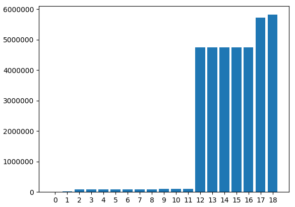
We've had to hid the feature names because they would overlap. However, all data has been printed. Here we can see that some columns have zero or few missing values and some columns that have a lot of them. We will have to accept the columns with few missing values because the column "ARRIVAL_DELAY", which is the one we've been using to generate the classification class, is one of those.
If we raise the "nan_count_limit" and uncomment the last line we can see the next image.
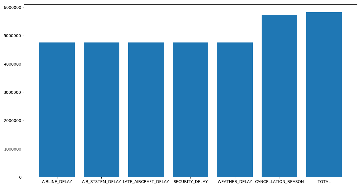
It's absolutely necessary to remove the columns that last. These columns add data about where the delay comes from, but the samples that add this information is so low, that they become unusable.
Dataset Transformation
Here we are applying all the necessary transformations to our dataset in order to make it usable.
Firstly we will generate the column that is our target.
dataset = pd.read_csv(r'data\flights.csv')
dataset['DIDNT_DELAY'] = (dataset['ARRIVAL_DELAY'] < 30).astype('int')
I won't be including one piece of code for readability, but here all columns except for "ORIGIN_AIRPORT", "DESTINATION_AIRPORT", "SCHEDULED_DEPARTURE", "DISTANCE" and "SCHEDULED_ARRIVAL" should be removed from the dataset.
It's because they didn't bring any value to the model or because they had too many missing values.
This can be done by using the "del" operator or the "df.drop()" method. Examples follow:
del dataset[column_name]
df.drop(list_of_column_names, axis=1, inplace=True)
Data Analysis:
Used features
- ORIGIN_AIRPORT: IATA code for the origin airport
- DESTINATION_AIRPORT: IATA code for the destination airport
- SCHEDULED_DEPARTURE: time of the sheduled moment for the plane to departure
- SCHEDULED_ARRIVAL: time of the sheduled moment for the plane to arrive
- DISTANCE: distance between the 2 airports in km
- ARRIVAL_DELAY: total delay of the flight in minutes
Data Correlation
Now, in the same way I generated the heatmap in the Suicide Rates blog post, I will be generating them here. The code is the exact same one.
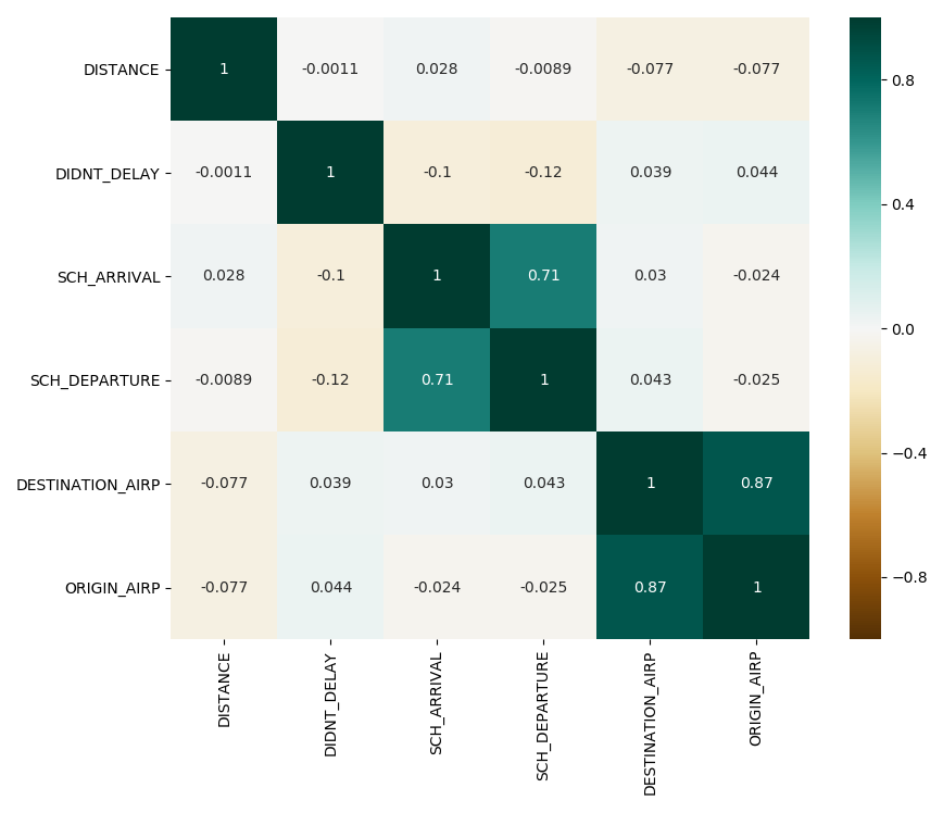
As we can see, there are two correlations that stand out in the heatmap.
The first correlation is between the time scheduled for the plane departure and the time scheduled for the plane to arrive. This makes sense, because the arrival time will always depend on the departure time, specially for flights between airports of the United States.
The second correlation is between the origin airport and the destination airport. This makes sense, because the flights between some airports will be more common because of closeness and stops, for instance.
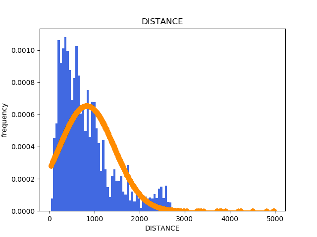
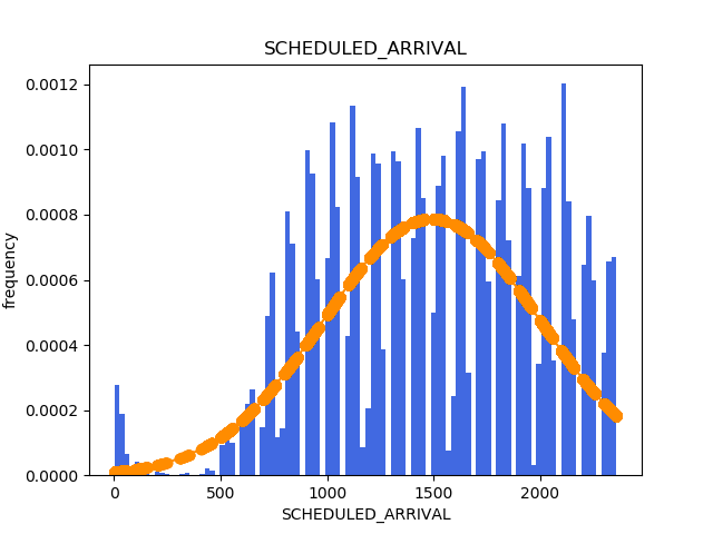
Histograms
Now, in the same way I generated the histograms in the Suicide Rates blog post, I will be generating them here. The code is the exact same one.
Normalization
Now we will have to factorise and normalise the data.
To learn more about these 2 steps, please head to Suicide Rates, where these steps are explained.
# transform categorical to continuous
factorizables_mapping = {}
factorizable_names = ['ORIGIN_AIRPORT', 'DESTINATION_AIRPORT']
for fact_name in factorizable_names:
    dataset[fact_name], factorizables_mapping[fact_name] = pd.factorize(dataset[fact_name])
# NORMALIZATION
scaler = sklearn.preprocessing.MinMaxScaler()
x = scaler.fit_transform(x)
y = y.values
Classification Metrics
Because this is a classification problem, we will be using specific metrics to value our model.
-
Accuracy: The accuracy measures the proportion of hits over the quantity of total samples. This is often the main metric to measure the quality of the model, and it's always convenient for it to be higher.
-
Precision: The precision measures the proportion of hits from the positive class over the total number of samples that have been predicted as positives. This means that a precision of 1.0 implies that every sample predicted as positive, actually is positive. However, nothing is stated about the classes predicted as negative, as they could be positive or negative.
Then, this metric gives us information about how sure is the model about the classes it predicts a positive class.
- Recall: The recall measures the proportion of hits in the positive class over the total number of samples that are actually from the positive class. This means that a recall of 1.0 implies that all the samples that were positive were properly detected as such.
This could look like a perfect classification, but this metrics doesn't take into account the classification that it's given to the negative samples. Then, a model that always predicts with a positive class will have a perfect recall, but will be completely useless.
Finally, the recall could be seen as it indicating what proportion of positive samples is detected as such.
Model Training
Here I'll be showing how to train the model using the K-fold Cross Validation method.
This method consists in dividing the whole dataset in equally-sized parts and one by one, train the model with all of them but one, and to test it with the remaining one. This is done once for every batch.
To do this I will be using the KFold class from sklearn, which already does the proper divisions for us and gives us the desired indexes every time. To this day, this is one of the most robust and efficient ways of testing a model. Also, we will be storing the accuracy, precision and recall of every iteration to be able to get different measures from the list of metrics.
Finally, in the metric calculation part we will be using functions named "get_confusion_matrix", "accuracy", "precision" and "recall". These will be included after this chunk of code.
train_accuracies = []
test_accuracies = []
train_precisions = []
test_precisions = []
train_recalls = []
test_recalls = []

# starting k-fold cross validation
kfold = sklearn.model_selection.KFold(n_splits=5)
for i, (train_indexes, test_indexes) in enumerate(kfold.split(x, y)):
    train_x = x[train_indexes, :]
    train_y = y[train_indexes]

    test_x = x[test_indexes, :]
    test_y = y[test_indexes]
    # training phase
    print('Iteration {}: Starting Training'.format(i))
    classifier = sklearn.linear_model.LogisticRegression(class_weight='balanced', n_jobs=16)
    classifier.fit(train_x, train_y)

    # prediction phase
    print('Iteration {}: Starting Prediction'.format(i))
    train_predicted = classifier.predict(train_x)
    test_predicted = classifier.predict(test_x)
    print('Iteration {}: Starting Metric Calculation'.format(i))

    # calculate all metrics
    train_confusion_matrix = get_confusion_matrix(train_y, train_predicted)
    test_confusion_matrix = get_confusion_matrix(test_y, test_predicted)

    train_accuracy = accuracy(train_confusion_matrix)
    test_accuracy = accuracy(test_confusion_matrix)

    train_precision = precision(train_confusion_matrix)
    test_precision = precision(test_confusion_matrix)

    train_recall = recall(train_confusion_matrix)
    test_recall = recall(test_confusion_matrix)

    # optional logging

    # append to the tracking lists
    train_accuracies.append(train_accuracy)
    test_accuracies.append(test_accuracy)

    train_precisions.append(train_precision)
    test_precisions.append(test_precision)

    train_recalls.append(train_recall)
    test_recalls.append(test_recall)
Now I will include the functions I talked about early. Because this dataset is so big, doing each the metric calculation everytime was starting to get slower. I included this functions in order to run the slow part only once ("get_confusion_matrix") and to extract the metrics fast and easy after.
def get_confusion_matrix(true, predicted):
    return sklearn.metrics.confusion_matrix(true, predicted)


def accuracy(confusion_matrix):
    denom = confusion_matrix.sum()
    if not denom:
        print("Forcing ill-defined accuracy to 0.0")
        return 0.0
    return (confusion_matrix[0][0] + confusion_matrix[1][1]) / denom


def precision(confusion_matrix):
    denom = confusion_matrix[0][1] + confusion_matrix[1][1]
    if not denom:
        print("Forcing ill-defined precision to 0.0")
        return 0.0
    return confusion_matrix[1][1] / denom


def recall(confusion_matrix):
    denom = confusion_matrix[1][0] + confusion_matrix[1][1]
    if not denom:
        print("Forcing ill-defined recall to 0.0")
        return 0.0
    return confusion_matrix[1][1] / denom
Now it's time to print the metrics we collected previously. In this case I added the mean, maximum and minimum of every metric we collected. Despite that, normally, the two most useful actions will be to look at all the values or to only look at the mean.
print("ACCURACY:")
print("MEAN: {}    MAX: {}    MIN: {}".format(np.mean(test_accuracies), max(test_accuracies), min(test_accuracies)))

print("PRECISION:")
print("MEAN: {}    MAX: {}    MIN: {}".format(np.mean(test_precisions), max(test_precisions), min(test_precisions)))

print("RECALL:")
print("MEAN: {}    MAX: {}    MIN: {}".format(np.mean(test_recalls), max(test_recalls), min(test_recalls)))
Finally, to be able to evaluate the quality of the model through a plot, the most used graphs are the ROC and Precision-Recall curve.
We can generate them with the following pieces of code:
# at this point we must have the following variables defined:
# "classifier" the classifier object
# "test_x" the features of the test dataset
# "test_y" the class of the test dataset

probs_test_y = classifier.predict_proba(test_x)[:, 1]
# ROC curve
plt.figure()

fpr, tpr, thresholds = sklearn.metrics.roc_curve(test_y, probs_test_y)
auc = sklearn.metrics.roc_auc_score(test_y, probs_test_y)

x = np.linspace(0, 1)
y = x
plt.plot(x, y, linestyle="--", label="auc = 0.5")

plt.plot(fpr, tpr, label="auc = " + str(auc))
plt.title("ROC Curve")
plt.xlabel("FPR (1 - Specificity)")
plt.ylabel("TPR (Sensitivity)")
plt.legend(loc=4)
# Precision-Recall curve
plt.figure()
precision, recall, threshold = sklearn.metrics.precision_recall_curve(test_y, probs_test_y)
avg = sklearn.metrics.average_precision_score(test_y, test_predicted)

plt.step(recall, precision, color='b', alpha=0.2, where='post')
plt.fill_between(recall, precision, alpha=0.2)

plt.xlabel('Recall')
plt.ylabel('Precision')
plt.ylim([0.0, 1.05])
plt.xlim([0.0, 1.0])
plt.title("Precision - Recall curve (AP={0:0.2f})".format(avg))