2019, Feb 07
How to get a second date
1. Introduction
Are you curious about knowing what influences love at first sight? Or about knowing what the key attributes to get a call are? In this article we will be covering a problem that will help us to discover what the attributes that make us more attractive to the eyes of other people are. In this case we will be using data extracted from a speed dating experiment, but the conclusions to which we will arrive could be extrapolated to any life situation where the first impressions are crucial, like for example job interviews.
As an outline of this article, the following topics will be covered:
- Data cleaning and preparation
- Analysis of gender differences in the partner selection
- Creation of a classification model to predict if a person will get a call after the date
- Evaluation of a classification model
The data used for this article has been obtained from Kaggle. This data was gathered from participants in a speed dating experiment conducted by two professors of the Columbia Business School. The aim of this experiment was to obtain experimental data to write a paper showing the gender differences in the mate selection (you can see this paper here).
During the experiment, the attendees had a four minute first date with all the other participants of the opposite sex. At the end of their speed date, the participants had to choose if they would have a second date and also had to rate their partner in the following six attributes: Attractiveness, Sincerity, Intelligence, Fun, Ambition and Shared Interests. The data also contains questionnaire data such as demographics, dating habits, self-perception of the attributes and lifestyle information.
These are the dependencies for this problem:
import pandas as pd
import numpy as np
import matplotlib.pyplot as plt

import scipy.stats as stats
import seaborn as sns

from sklearn.model_selection import train_test_split
from sklearn.ensemble import RandomForestClassifier

from sklearn.metrics import confusion_matrix
from sklearn import metrics
2. Data cleaning and preparation
The first step of all problems is reading our data. It is specified at Kaggle to read this data with the following encoding because it contains special characters.
data_path = "Speed_Dating_Data.csv"

#Reading the CSV data
data = pd.read_csv(data_path, delimiter = ",", encoding = "ISO-8859-1")
call_col = data.loc[:, "them_cal"]
The second step is to check the number of NaN values of each column:
print(data.isnull().sum())
As we can see, there are a lot of columns that have a large number of NaN values. These columns will not give us information and will hinder the training process of the model. Therefore, we will drop the columns with more than 800 NaN values with the following code.
The only exception that we will have for this rule will be the column “them_cal” because it is the one that we want to predict in our problem.
# Drop columns with more than 800 NaN values
max_num_nan = 800
data = data.loc[:, (data.isnull().sum() < max_num_nan)]
data["them_cal"] = call_col
Now, we will delete all the rows with remaining NaN values.
# Drop rows with NaN values
data = data.dropna()
The following step is usually check the types of the columns, because there are columns that are not useful in the process of training the classification model.
print (data.dtypes)
As we can see, there are some columns of the type object, which we are going to drop.
# Drop columns of type 'object'
data = data.loc[:, (data.dtypes != 'object')]
In the description of the data it is specified that in the waves from 6 to 9 the participants had to rate the partners with a different method than all the other waves. Since this two methods can’t be mixed, we will drop the rows from the waves from 6 to 9.
# Deleting the waves with different representation
data = data[(data.wave > 9) | (data.wave < 6)]
The last thing we need to do to prepare our data is to get the column that we will want to predict. In the dataset we have the column “them_cal”, that specifies the number of calls this participant has received. We only want to predict if a participant had received any call after the date, so we will convert the column “them_cal” into a binary column named “call”.
# Creating the variable 'call' (Y)
data['call'] = data['them_cal'].map(lambda x: x == 0).astype(int)
data.drop('them_cal', axis=1, inplace=True)
3. Data Analysis
Since the data has a lot attributes, it is very difficult to understand exactly how it is and how it is distributed. That’s the main reason why we need to perform a data analysis before getting to work on the classification model.
The first recommendable thing to do is to analyse the histograms and normal distribution of the attributes. The more normal the distribution of the data the better, because the classification model will not be biased to one of the classes.
The following function is used to plot a histogram and the normal distribution line for a specific attribute:
def histogram(data, column_name):
    column_data = sorted(data.loc[:, column_name])

    fit = stats.norm.pdf(column_data, np.mean(column_data), np.std(column_data))

    plt.title(column_name)
    plt.xlabel(column_name)
    plt.ylabel("frequency")
    plt.plot(column_data, fit, 'o-', color = "salmon")
    plt.hist(column_data, color = "skyblue", density = True, rwidth = 0.75)

    plt.savefig("histograms/" + column_name + ".png")
    plt.close()
We can plot all the attributes histograms using the following loop:
column_names = data.columns.values

for col in column_names:
    histogram(data, col)
All the plots will be saved into a folder named histograms.
Now that we have all our histograms, let’s find some interesting attributes and check their distributions.
For example, the first thing that we can check is if our Y variable (call) is balanced. With the following histogram we can see that there is approximately the same number of participants who received a call as participants who didn’t receive any call.

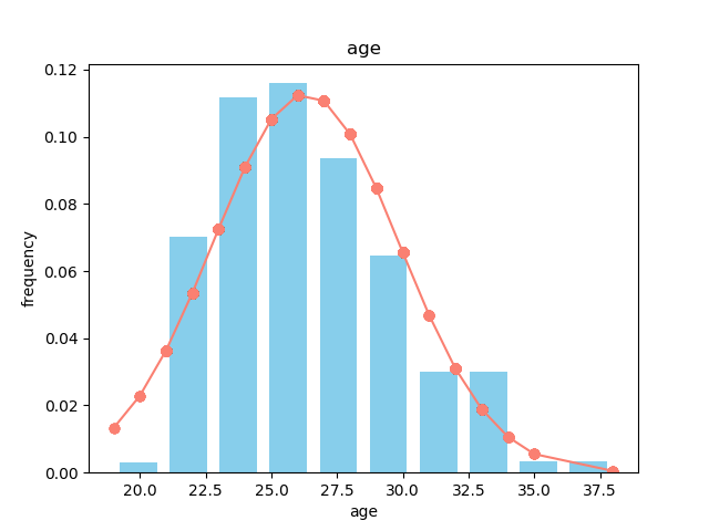
The next thing we can check are attributes that can help us to better understand how the experiment was performed. For instance, we will check the age and gender distribution of the data. It can easily be seen with the histograms that the age of the participants is within a range of 20 to 35, and that there are more females (0) than males (1) participating in the experiment.

In the data we also have the six attributes that we mentioned in the introduction:
- Attractiveness
- Sincerity
- Intelligence
- Fun
- Ambition
- Shared Interests
Each participant had to rate each partner in these 6 attributes, distributing 100 point between the different attributes.
As well, the data have ratings of each participant in the following hobbies or lifestyle interests:
- Sports
- Tv sports
- Exercise
- Dining
- Museums
- Art
- Hiking
- Gaming
- Clubbing
- Reading
- TV
- Theatre
- Movies
- Concerts
- Music
- Shopping
- Yoga
The aim of this article is to discover what personal traits and likes are the ones that make a person more appealing to the other people. That’s why we will try to find if these attributes have any correlation with the fact of receiving a call after the meetup.
In first place, we have created a function to plot the correlation matrix of some variables using the Seaborn library:
def correlation_matrix(data):
    plt.figure()
    sns.heatmap(data.corr(), center=0, annot=True, vmin=-1, vmax=1, cmap="RdBu_r")
    plt.savefig("plots/attr_heatmap.png")
    plt.close()
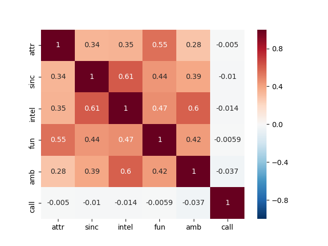
With that function we will plot the correlation between the personal attributes, the fact of matching in the date and the fact of receiving a call some days later:
# Correlation matrix of the 6 personal attributes
attributes = ['attr', 'sinc', 'intel', 'fun', 'amb', 'match', 'call']
attr_data = data.loc[:, attributes]
correlation_matrix(attr_data)
We will also plot the same correlation heatmap but with the personal interests and hobbies:
interests = ['sports', 'tvsports', 'exercise', 'dining', 'museums', 'art',
             'hiking', 'gaming', 'clubbing', 'reading', 'tv', 'theater',
             'movies', 'concerts', 'music', 'shopping', 'yoga', 'call']
int_data = data.loc[:, interests]
correlation_matrix(int_data)
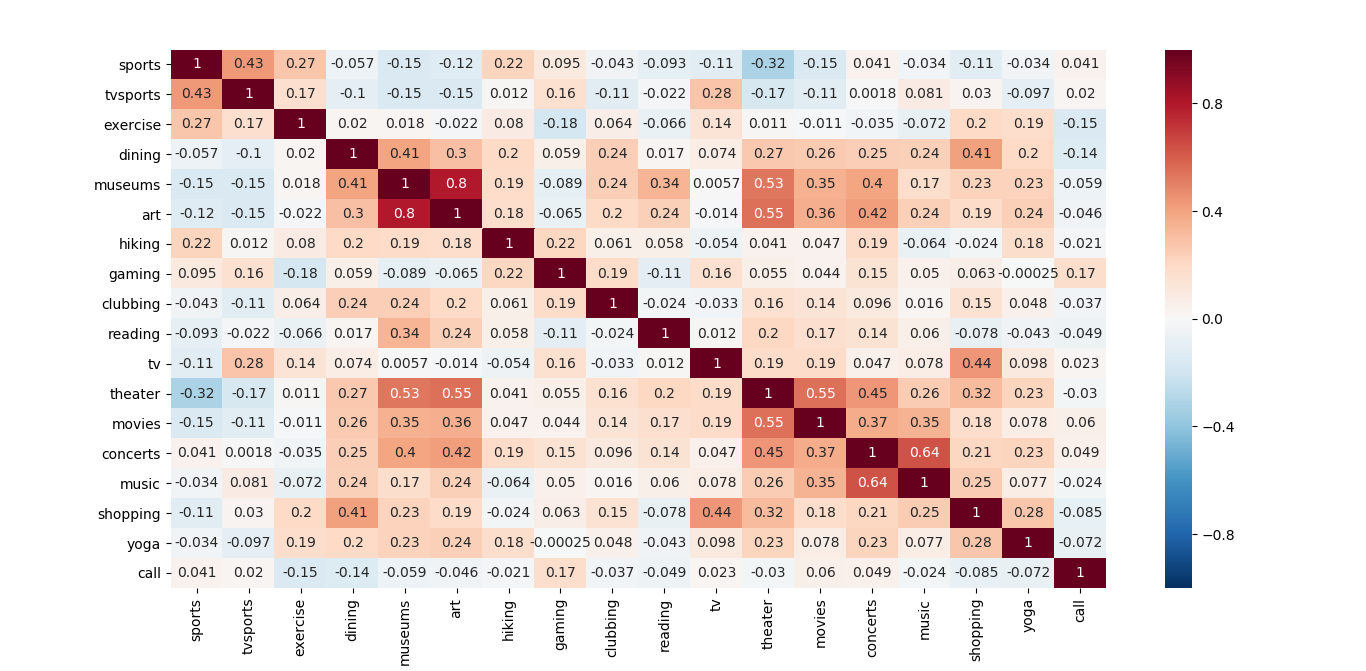
If we focus on the correlations of all the analysed variables with the fact of receiving a call, we can obtain a conclusion. At the moment of the truth, none of the attributes or the personal likes are really correlated with the fact of receiving a call after the date.
Nevertheless, in these correlation maps we can observe that the Attractiveness is highly correlated with the Fun, and the same thing happens with the Intelligence and the Ambition. Also, some of the personal interests have a high value of correlation, like for example going to museums with liking art or going to concerts with liking to listen to music.
Last but not least, we want to explore one of the topics why this experiment was performed: the differences between males and females when looking for a partner. It is important to explore the problem when we are working with data, because it will allow us to understand the information within these data.
In the dataset we have some columns that contain the ratings of every participant of which attributes are the ones that is looking for in the opposite sex. With these columns we can plot the preferences of males and females in the 6 mentioned personal attributes.
We will plot this information in a spider chart with the following function:
def spider_chart_combined(data_columns_males, data_columns_females, title):
    labels = np.array(['Attractiveness', 'Sincerity', 'Intelligence', 'Fun', 'Ambition', 'Shared interests'])

    # To close the plot
    average_males = data_columns_males.mean()
    average_males = np.concatenate((average_males, [average_males[0]]))
    average_females = data_columns_females.mean()
    average_females = np.concatenate((average_females, [average_females[0]]))
    angles = np.linspace(0, 2 * np.pi, len(labels), endpoint=False)
    angles = np.concatenate((angles, [angles[0]]))

    fig = plt.figure()
    ax = fig.add_subplot(111, polar=True)
    ax.plot(angles, average_males, 'b', linewidth=2)
    ax.fill(angles, average_males, 'b', alpha=0.25)
    ax.plot(angles, average_females, 'r', linewidth=2)
    ax.fill(angles, average_females, 'r', alpha=0.25)
    ax.set_thetagrids(angles * 180 / np.pi, labels)
    ax.set_title(title)
    ax.grid(True)

    fig.legend(["Male", "Female"], loc=4)
    fig.savefig("plots/spider_chart.png")
To this function we have to pass the 6 attributes columns split by gender and the title we want for the plot. So, the first step is to separate the data between genders and to select the specific columns:
data_males = data[data.gender == 1]
data_females = data[data.gender == 0]

columns_opp_sex = ['attr1_1', 'sinc1_1', 'intel1_1', 'fun1_1', 'amb1_1', 'shar1_1']

col_males = data_males.loc[:, columns_opp_sex]
col_females = data_females.loc[:, columns_opp_sex]
title = "What are the participants looking for in the opposite sex?"

spider_chart_combined(col_males, col_females, title)

We also can plot with this function what the attributes that each sex thinks the opposite is more interested in are:
columns_opp_sex_wants = ['attr2_1', 'sinc2_1', 'intel2_1', 'fun2_1', 'amb2_1', 'shar2_1']

col_males = data_males.loc[:, columns_opp_sex_wants]
col_females = data_females.loc[:, columns_opp_sex_wants]
title = "What the participants think the opposite sex wants?"

spider_chart_combined(col_males, col_females, title)

Looking at these 2 graphs we can extract a clear conclusion. The male participants of the experiment are strongly conditioned by the physical attractiveness of the female participants. This personal attribute seems to be the most important for men when looking for a partner.
On the other hand, the female participants seem to be aware of this fact, as can be observed in the second image. Women expect the attractiveness to be the most desirable attribute in the eyes of men.
4. Classification model
Now that we have prepared and analysed our data, we can proceed to use a classification model to predict if a participant will receive a call from the date or not. The first thing we will do is to drop some columns that will hinder the classification model, like for example the ids, and then we will select the X and the y:
data = data.drop(["iid", "id", "pid", "idg"], axis=1)

y = data["call"]
X = data.drop("call", axis=1)
The following step is to split the data. Normally the most common method to evaluate correctly a model is to use a K-fold method, but since we want to create some graphics with the predictions later we will perform a Holdout partition.
X_train, X_test, y_train, y_test = train_test_split(X, y, test_size=0.33)
Then we will declare, train and predict with a Random Forest Classifier:
rf = RandomForestClassifier(n_estimators=100, max_depth=2, random_state=0)
rf.fit(X_train, y_train)

y_pred = rf.predict(X_test)

print("Accuracy: " + str(rf.score(X_test, y_test)))
5. Evaluation
5.1. Confusion Matrix
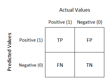
When we are evaluating a classification model, the most common thing to do is a confusion matrix. Each row of this matrix represents the instances of the predicted class, while each column represents the instances of the actual class.
In a binary classification problem, this matrix has 2 rows and 2 columns and reports the number of false positives, false negatives, true positives and true negatives.
Since accuracy is not a reliable metric for the real performance of a classification, it is important to know how to calculate and use a Confusion Matrix.
# Confusion matrix
confusion_matrix = confusion_matrix(y_test, y_pred)

print(confusion_matrix)
# Plotting the confusion matrix
plt.clf()
plt.imshow(confusion_matrix, interpolation='nearest')
classNames = ['No call','Call']
plt.title('Confusion Matrix')
plt.ylabel('True label')
plt.xlabel('Predicted label')
tick_marks = np.arange(len(classNames))
plt.xticks(tick_marks, classNames, rotation=45)
plt.yticks(tick_marks, classNames)
s = [['TN','FP'], ['FN', 'TP']]
for i in range(2):
    for j in range(2):
        plt.text(j, i, str(s[i][j]) + " = " + str(confusion_matrix[i][j]))
plt.show()
plt.close()

5.2. ROC Curve
The ROC curve is created by plotting the true positive rate (TPR) against the false positive rate (FPR) at various threshold settings. The TPR is also known as sensitivity or recall, and the FPR is the same as calculating 1 - specificity.
The hypothetical perfect classifier would be the one with a sensitivity and a specificity of 1 (TPR = 1 and FPR = 0). (the red line). In the following image we can observe the ideal ROC curve, a good ROC curve, and the worst ROC curve that can be obtained.
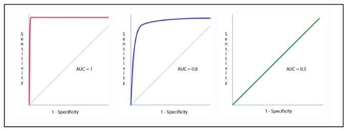
The Area Under the Curve (AUC) tells how much the model is capable of distinguishing between classes. Basically, this value says how close our ROC curve is to the ideal ROC curve. The closer this area is to 1 the better. On the other hand, if this value is closer to 0.5 or less it means that the model is not performing well.
# ROC curve
y_probs = rf.predict_proba(X_test)[::,1]

fpr, tpr, thresholds = metrics.roc_curve(y_test, y_probs)
auc = metrics.roc_auc_score(y_test, y_probs)

x = np.linspace(0, 1)
y = x
plt.plot(x, y, linestyle="--", label="auc = 0.5")

plt.plot(fpr, tpr, label="auc = " + str(auc))
plt.title("ROC Curve")
plt.xlabel("FPR (1 - Specificity)")
plt.ylabel("TPR (Sensitivity)")
plt.legend(loc=4)
plt.show()
plt.close()

This is the obtained ROC curve with the 0.5 AUC line for reference.
The AUC obtained for this problem is 0.89, which is a good value for a classification model. This basically means there is 89% chance that the model will be able to distinguish between the positive class and the negative class.
5.3. Precision-Recall Curve
The precision recall curve summarize the trade-off between the true positive rate and the positive predictive value for a predictive model using different probability thresholds.
# Precision - Recall Curve ------------------------------------
precision, recall, threshold = metrics.precision_recall_curve(y_test, y_probs)
avg = metrics.average_precision_score(y_test, y_pred)

plt.step(recall, precision, color='b', alpha=0.2, where='post')
plt.fill_between(recall, precision, alpha=0.2)

plt.xlabel('Recall')
plt.ylabel('Precision')
plt.ylim([0.0, 1.05])
plt.xlim([0.0, 1.0])
plt.title("Precision - Recall curve (AP={0:0.2f})".format(avg))
plt.show()

This Precision - Recall curve and the calculated Average Precision (AP) are showing that the classification works as expected. We've obtained an Average Precision of 0.78, that is an acceptable value for the trade-off between precision and recall.
6. Conclusions
With all the obtained results and plots we have obtained some conclusions for this problem:
- Men are highly conditioned by the attractiveness of the female participants.
- Women preferences are more evenly distributed, but the Intelligence is the attribute that they slightly appreciate more.
- At the moment of the truth, the personal attributes and the personal likes are not highly related with the fact of receiving a call days after the date.
- Our model is working properly, as can be seen in the ROC and Precision-Recall curves.