2019, Jun 07
A beginner's guide to data competitions
1. Introduction
In this post we will talk about the Titanic: Machine Learning from the disaster Kaggle competition.
This competition consists in predicting if a person survived the Titanic disaster knowing some of its attributes, such as the gender, the ticket class or the age. Although there was some element of luck involved in surviving the sinking, some groups of people were more likely to survive the tragedy. Therefore, the challenge on this competition is to find, using machine learning tools, the groups of people that were more likely to live.
import pandas as pd
from sklearn.ensemble import AdaBoostClassifier, RandomForestClassifier
from sklearn.tree import DecisionTreeClassifier
import xgboost as xgb

import matplotlib.pyplot as plt
import seaborn as sns
2. Data cleaning
First, we will explain the own simple solution to the problem. The first step, as always, is reading the data and seeing what we have:
# 1. Reading train data
train_data = pd.read_csv("train.csv")
print(train_data.head())
The attributes are:
- Survived: (0 = No, 1 = Yes)
- Pclass: Ticket class (1 = 1st, 2 = 2nd, 3 = 3rd)
- Sex Male or Female
- Age Age in years
- sibsp: Number of siblings / spouses aboard the Titanic
- parch: Number of parents / children aboard the Titanic
- ticket: Ticket number
- fare: Passenger fare
- Cabin: Cabin number
- Embarked: Port of Embarkation (C = Cherbourg, Q = Queenstown, S = Southampton)
Let’s see the missing values:
print(train_data.isnull().sum())
As we can see, the variables Cabin, Age and Embarked are the only ones with missing values. The variable Cabin has a too big number of NaN values, so we will drop it. On the other hand, we will fill the missing values from Age and Embarked:
train_data['Embarked'].fillna(train_data['Embarked'].mode()[0], inplace=True)
train_data["Age"].fillna(train_data["Age"].median(), inplace=True)
We will now delete some text variables and we will convert the categorical variables into number:
train_data = train_data.drop(["Name", "Ticket", "Cabin"], axis=1)

train_data.Sex = pd.Categorical(train_data.Sex)
train_data.Sex = train_data.Sex.cat.codes

train_data.Embarked = pd.Categorical(train_data.Embarked)
train_data.Embarked = train_data.Embarked.cat.codes

train_data = train_data.dropna()

print(train_data.head())
Now we will repeat the same process with the test data, but not deleting the rows with NaN values because then we wouldn’t have a correct submission format:
# 2. Reading test data

test_data = pd.read_csv("test.csv")

test_data = test_data.drop(["Name", "Ticket", "Cabin"], axis=1)

test_data.Sex = pd.Categorical(test_data.Sex)
test_data.Sex = test_data.Sex.cat.codes

test_data.Embarked = pd.Categorical(test_data.Embarked)
test_data.Embarked = test_data.Embarked.cat.codes

test_data["Age"] = test_data["Age"].fillna(test_data["Age"].mean())
test_data["Fare"] = test_data["Fare"].fillna(test_data["Fare"].median())
3. Data analysis
Before using a classification model, we will explore some facts about the data. First, we will find how correlated are the different variables with the fact of surviving:
def correlation_matrix(data):
    plt.figure()
    sns.heatmap(data.corr(), center=0, annot=True, vmin=-1, vmax=1, cmap="RdBu_r")
    plt.show()

correlation_matrix(train_data)

If we observe the obtained correlation matrix, we can see that the Ticket class is correlated with the fact of surviving and the Sex is inversely correlated.
So, let’s analyse these the Sex, Ticket class and Age to understand which groups of people were more likely to survive:
survived = train_data[train_data["Survived"] == 1]
not_survived = train_data[train_data["Survived"] == 0]
plt.figure()
plt.title("Age distribution")
sns.distplot(survived["Age"], hist=False, kde_kws={"shade": True}, label="Survived")
sns.distplot(not_survived["Age"], hist=False, kde_kws={"shade": True}, label="Didn't survived")
plt.legend()
plt.show()
plt.close()
plt.figure()
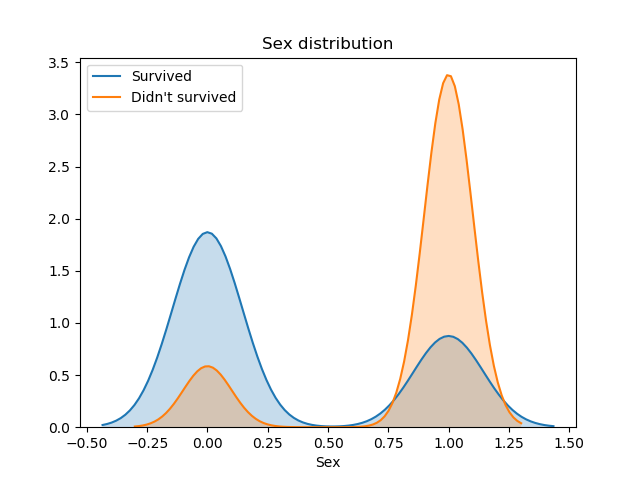
plt.title("Sex distribution")
sns.distplot(survived["Sex"], hist=False, kde_kws={"shade": True}, label="Survived")
sns.distplot(not_survived["Sex"], hist=False, kde_kws={"shade": True}, label="Didn't survived")
plt.legend()
plt.close()
plt.figure()
plt.title("Ticket class distribution")
sns.distplot(survived["Pclass"], hist=False, kde_kws={"shade": True}, label="Survived")
sns.distplot(not_survived["Pclass"], hist=False, kde_kws={"shade": True}, label="Didn't survived")
plt.legend()
plt.show()
plt.close()


Very interesting conclusions can be extracted from these distributions. Firstly, passengers under 15 year olds had a greater chance of survival. The 15–35 age band had much worse odds and the survival rate was essentially 50:50.
Also, we can affirm that women had priority in the rescue, because we can see that survived twice as many women than men.
Finally, the Ticket class was also related with the fact of surviving. The majority of passengers were traveling in 3rd class, but the people who survived the most belonged to the 1st and 2nd class. We can affirm, then, that richest people had priority in the evacuation.
4. Classification
First of all, we have to prepare out train and test variables:
y_train = train_data["Survived"]
X_train = train_data.drop(["Survived", "PassengerId"], axis=1)

X_test = test_data.drop("PassengerId", axis=1)
Now we are ready to use a classification model. Because this is a competition, a very good practise is to try different popular models and get the one with better results. We will try 4 different models:
- Decision Tree
- Random Forest
- AdaBoost
- XGBoost
# 3. Classification

models = [RandomForestClassifier(n_estimators=100), AdaBoostClassifier(), xgb.XGBClassifier(), DecisionTreeClassifier()]

for model in models:
    print(model)
    model.fit(X_train, y_train)

    print(model.score(X_train, y_train))
The Random Forest model can calculate the importance of each one of the features. We will show that information in a bar plot to understand which variables are giving more information to the model:
random_forest = models[0]
plt.figure()
colors = ["turquoise", "teal", "lightblue", "steelblue", "cornflowerblue"]
pd.Series(random_forest.feature_importances_, X_train.columns).sort_values(ascending=True)\
    .plot.barh(width=0.8, ax=plt.gca(), color=colors)
plt.title('Feature Importances')
plt.show()

In this plot we can observe that the Fare, the Sex and the Age are the variables that are giving more information to the Random Forest model. This plot can also be useful to drop the variables with less importance, as for example the Embarked attribute.
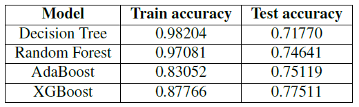
Finally, the model with better results is XGBoost. We will use this trained model to predict the test data and make a submission to the competition.
The submission for the competition needs to have a very specific format. This format consists in a column named “PassengerId” with the IDs from the passengers, and in a column named “Survived” with the result of the prediction, that has to be a 0 or a 1. The train dataset has 418 rows (plus the header), so the submission must have the same number of predictions.
# 4. Submission
y_pred = models[3].predict(X_test)

test_data['Survived'] = y_pred
submission = test_data.loc[:, ["PassengerId", "Survived"]]

submission.to_csv("submission.csv", index=False)
The score we obtained in Kaggle with these models are:
4. Conclusions
Some of the conclusions of this post are:
- More than twice as many woman than men survived the disaster.
- Passengers under 15 years old had a greater chance of survival.
- Rich people with a more expensive Ticket class survived more than people with 3rd class tickets.
Finally, in the Kaggle competition, with the XGboost submission we obtained a position in the second quartile. The next steps to obtain better results would be a better data engineering to obtain new variables form the existing ones and performing a fine tuning to the classification model.
The most popular Kaggle Kernel for this competition can be visited here. The author shows how to obtain a 90% accuracy for this problem.